
Quick Summary
A cohesive home interior comes from deciding the whole-home look before buying anything, then repeating one colour palette, a few materials and finishes across every room. Start by writing down the feeling you want and the two or three words that describe your style, then build from there.
- Use roughly 60 per cent dominant neutral, 30 per cent supporting tone and 10 per cent accent.
- Test paint and fabric samples for at least a week in morning, midday and night light.
- Repeat one or two finishes, such as brass or warm wood, across the house.
- Start room-by-room with the entry and hallway, then the living area.
- Limit yourself to one bold pattern per room to avoid a busy look.
Table of Contents
- Start With a Whole-Home Vision
- Build a Mood Board and Find Your Common Threads
- Choose an Interior Design Colour Palette You Can Repeat
- Repeat Materials, Finishes and Textures Across Rooms
- How to Mix Interior Design Styles Without Clashing
- Plan Room-by-Room Within Your Existing Layout and Budget
- Where to Shop for Pieces That Fit Your Theme
- Test Your Theme, Fix Common Mistakes and Book Your First Room
- Frequently Asked Questions
Start With a Whole-Home Vision
Last Updated: November 5, 2026
A cohesive home interior theme is the thread that ties every room together, so your living room, kitchen and bedroom feel like they belong to one house and form a cohesive home interior. This guide will help you build that look step by step, whether you are starting from scratch or pulling an existing space together.
Most people try to decorate one room at a time. That works until the lounge looks like a beach house and the spare room looks like a farmhouse. The fix is to decide on the whole-home picture before buying anything.
Ask yourself three questions:
- What feeling should I get when I walk through my front door?
- Which two or three words describe the look I like (warm, coastal, minimal, earthy)?
- Which rooms do I see from one another, and which are closed off?
Write the answers down. They become your design brief, and every later decision gets checked against it.
Build a Mood Board and Find Your Common Threads
A mood board turns vague taste into something you can see. Gather images from magazines, saved social posts and photos of things you already own.
Then look for the common threads. Lay the images side by side and ask what keeps showing up. Often it is a colour, a material like timber or linen, or a shape like rounded edges.
A simple way to do it:
- Collect 15 to 25 images you genuinely love
- Remove any that feel off, even if you cannot say why
- Group what remains by colour, material and mood
- Note the two or three themes that appear most
Your existing belongings matter too. A cushion you adore or a rug you cannot part with is a clue to your taste. Build around it rather than against it.
Choose an Interior Design Colour Palette You Can Repeat
Colour is the fastest way to make a home feel connected, but most palettes fail because they are chosen from a paint chip rather than a method. Use a repeatable process so the palette survives every room and every lighting condition.
Step 1: Set proportions, not just colours. A workable split is roughly 60 per cent dominant neutral, 30 per cent supporting tone and 10 per cent accent. Write the split down next to your swatches. If your accent creeps past about a tenth of a room's visible surfaces, the room starts to feel themed rather than cohesive.
Step 2: Choose in this order. Pick the dominant neutral first, it will cover walls, large furniture and flooring, so it must work with fixed features you cannot change. Then choose one or two supporting tones that sit next to the dominant on the colour wheel or share its undertone.
Step 3: Test in the room, not the shop. Paint an A4-sized sample patch on two walls that face different directions, or tape a fabric swatch beside your sofa. Leave it for at least a week and check it in morning light, midday light and at night under your actual bulbs. A warm white that looks calm at noon can read yellow under evening downlights, and a grey can turn blue in a south-facing room.
Step 4: Repeat with intent. Put your accent in a cushion, a vase and a piece of art, three placements in a room is usually enough. Use your neutral on walls and larger furniture. Carry the same supporting tone into a rug or throw so the eye has a path to follow from room to room.
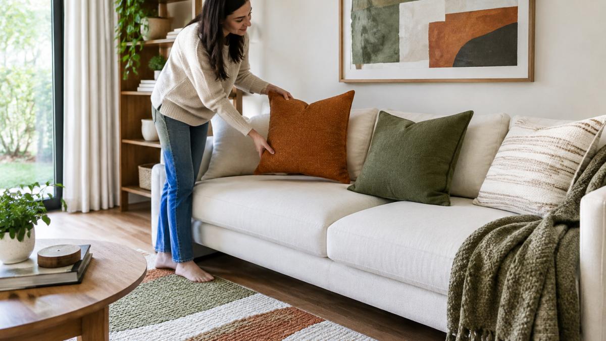
A bright, lived-in living room shows how this works in practice: three coordinated colours repeat across a sofa cushion, a rug and wall art.
Watch out: if you cannot name which colour is dominant, supporting and accent, you have a collection of colours rather than a palette, cut one before you buy anything else. If a room already feels overloaded, remove the accent from one surface rather than repainting the walls; the neutral is rarely the problem.
Repeat Materials, Finishes and Textures Across Rooms
Colour gets the attention, but materials create the feeling of unity. If your kitchen has brushed brass handles, repeat brass in a lamp or picture frame elsewhere.
Repeat textures too. A chunky knit throw, a woven basket and a linen curtain all add softness. Mixing several textures across rooms stops a space from feeling flat.
Keep an eye on finishes. Matt black, warm wood and polished chrome each send a different signal. Choose one or two finishes and use them across the house.
How to Mix Interior Design Styles Without Clashing
Many homes blend styles, such as mid-century furniture with a coastal rug. This can look great, but it needs structure.
Road & Home - Quirky Printable Wall Art Set (3 Designs) →
Use the rule of one anchor. Pick one style to lead, then add pieces from a second style in smaller amounts. Keep your palette and materials consistent so the mix reads as intentional.
Watch out: mixing too many patterns at once makes a room feel busy. Limit yourself to one bold pattern per room.
Plan Room-by-Room Within Your Existing Layout and Budget
Your floor plan decides how much cohesion you can achieve in a cohesive home interior, so plan the sequence before you shop. Work from the rooms people see first and most often, and let each finished room become the reference for the next.
A practical implementation sequence:
- Entry and hallway: set the tone with one signature piece and your dominant neutral. This is the first thing visitors see and the cheapest room to get right.
- Living area: lead with your full palette and your strongest material repeats, because this room is usually visible from the most other spaces.
- Bedrooms: keep the calmest version of the theme, same palette, softer textures, fewer accents.
- Kitchen and bathroom: repeat finishes from elsewhere in the home rather than introducing new ones. These rooms are expensive to change, so coordination matters more than novelty.
- Transition spaces: treat hallways, landings and doorways as links, not rooms. Repeat one colour or material from each adjoining space so the eye carries through.
Work around fixed features first. List what you cannot change, flooring, cabinetry, bench tops, window frames, architectural details, and note their colour and finish. Choose your dominant neutral to sit with those features rather than fight them.
Budget in tiers. A low-cost, reversible tier covers textiles, lighting, wall art and hardware swaps, cushions, throws, lampshades, handles and prints. A mid tier adds rugs, side tables and occasional chairs. A high tier covers sofas, cabinetry and built-in joinery. Phase purchases in that order so each tier is checked against the finished room before you spend on the next.
Handle open-plan and awkward layouts deliberately. In open-plan spaces, create zones with rugs, lighting and furniture placement rather than walls, and repeat one material across each zone boundary so the areas read as related. In long or narrow rooms, place your strongest repeat at the far sightline so the eye has a destination.
Watch out: buying a whole room at once locks in decisions before you have seen how the palette behaves in that light, finish one tier, live with it for a fortnight, then continue.
The article suggests a room-by-room sequence and tiered budget, summarised below.
| Step | Focus | Why it comes here |
|---|---|---|
| 1. Entry and hallway | Signature piece and dominant neutral | First thing visitors see; cheapest room to get right |
| 2. Living area | Full palette and strongest material repeats | Usually visible from the most other spaces |
| 3. Bedrooms | Calmest version of the theme | Softer textures, fewer accents |
| 4. Kitchen and bathroom | Repeat existing finishes | Expensive to change, so coordination matters most |
| 5. Transition spaces | Repeat one colour or material | Links adjoining rooms so the eye carries through |
Where to Shop for Pieces That Fit Your Theme
Once your palette and materials are set, shopping becomes easier. Look for pieces that repeat your chosen colours and textures, and check the details before you buy.
Our pick for unique finds is the Road & Home - Quirky Printable Wall Art Set (3 Designs). At $8.00, it is a simple way to add a warm, playful accent to a wall. It is a digital PDF with A4 and A5 designs, so you print it at the size you need.

Check shipping and returns before you commit to larger furniture. For more on delivery costs, see our guide on how to compare furniture shipping costs. If you are looking for pieces that suit a particular look, browse our range of unique home decor items to buy online. Many shoppers also find it useful to find quality home goods that match their theme.
If you are deciding where to buy, our best online stores for home in Australia guide compares the main options.
Test Your Theme, Fix Common Mistakes and Book Your First Room
Before you finish, stand in each room and check the links. Do you see the palette repeated? Do the materials feel connected? Remove anything that breaks the flow.
Common mistakes to avoid:
- Matching everything too closely, which looks like a showroom
- Ignoring the view from one room into the next
- Buying an entire set at once instead of building over time
Australian Government consumer guidance on online shopping and returns
Start with one room. A bedroom or living area is a good first project because the results show quickly. Once that room feels right, use it as the reference point for the rest of the house.
Frequently Asked Questions
How do I make my home look cohesive on a budget?
Start with the colours and materials you already own and choose two or three accent colours to repeat across rooms. Swap cushions, throws, lamps and artwork rather than furniture, since these carry the most visual weight for the least cost. Printable wall art is a low-cost way to repeat a palette: a set of matching prints in your chosen colours ties rooms together. Buy one new item at a time, check it against your palette, and only keep pieces that repeat a colour, pattern or finish already in the room.
What is the 60-30-10 rule in interior design?
The 60-30-10 rule is a proportion guide for colour. Roughly 60 per cent of a room is your dominant colour, usually walls and large upholstery, 30 per cent is a secondary colour such as curtains, rugs or a sofa, and 10 per cent is an accent colour in cushions, art or small decor. Applying the same proportions in each room makes a home feel unified even when the rooms have different functions. It works best as a starting framework that you adjust to suit your light and furniture.
How do you connect different rooms with different styles?
Connect rooms by repeating at least one colour, one material and one metal finish in each space. For example, if your hallway has brass light fittings, repeat brass in the kitchen cabinet hardware and the bedroom lamp. Keep wall colours in the same family between open or adjacent spaces so sightlines feel continuous. Recurring elements such as a rug style, a plant or a particular artwork frame also help rooms read as one home rather than separate projects.
Can you mix interior design styles and still have a cohesive home?
Yes, provided the styles share a common thread. Choose a unifying colour palette and repeat it in every room, then vary the style through shape, texture and era. A mid-century sofa can sit alongside a rustic timber table if both use the same warm neutrals and metal finish. Limit yourself to two or three dominant styles, and use one to anchor each room. Mixing works when variety has a clear rhythm rather than competing with it.
